In the language of eCommerce, the ‘call to action’ is nothing but a gateway from one stage to another. When you click on CTA, you go to the next level; it is a journey towards checkout and that is what makes it extremely important. So, if one CTA goes wrong, it will block visitors’ journey to checkout page. It is important for the Magento ecommerce development professionals to know that CTAs play an integral role in converting a visitor to customer. So, if you want to reduce your bounce rate and increase conversion rate, you must out emphasis on the ‘Call to Actions’.
An ideal call to action should be easy to spot and the text should be simple, yet actionable.
Most people find it obvious to focus on call to action, but they are not aware of the silly mistakes they do! You must check if you are doing to right! Your CTAs should make sense to users and should compel them to click on it. If they don’t tell users about what to do next, users will never click on it.
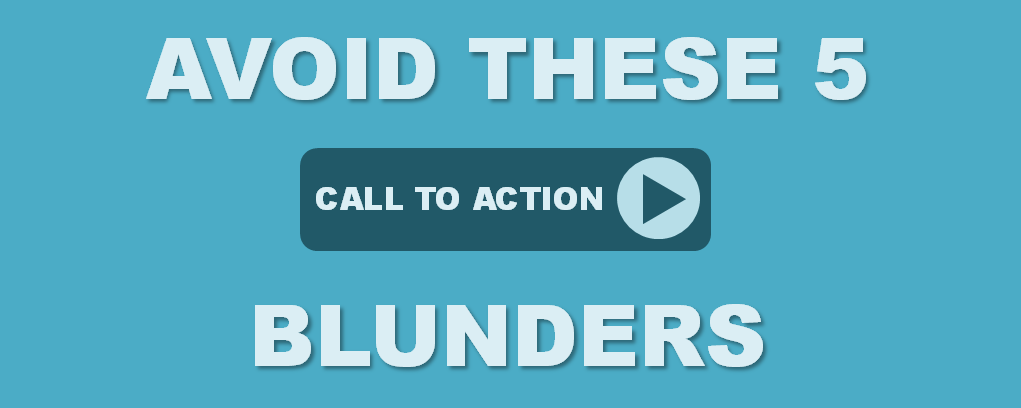
Here are the most common ‘Call to Action’ blunders most people make…
1. Bad place:
Placing the button at the wrong place is one of the biggest mistakes you can ever do with the Call to Action. What are the chances of people clicking on the button if they cannot see it? Negligible, right? Well, if you put it amidst the graphics and text, no user will take pains to find it. So, make sure you put it at a place where users spot it easily.
2. Wrong color:
The color of the button creates huge impact on the minds of users. Different colors create different impressions like green looks more inviting, red looks not so secured and blue looks better. The look of the CTA matters a lot and you must choose the right color for your button.
3. No text or Bad text:
Even though all of us are aware of that red color on the remote control of TV is to switch it off, they still write the text on or below the button to guide users. The text should say about the next action. So, make sure your CTAs are self explanatory like ‘Save the changes’, ‘Get a free quote’ or ‘create an account’.
4. Over doing it:
Don’t put in more than one primary Call to action buttons on the same page, or else they will get confused as to which one to choose. You can give a text link as other choice to the main CTA, but don’t make them choose between the two primary ‘call to actions’.
5. No CTA at all:
Each page is for a purpose and don’t miss the chance to convert in any page. Each of them should have at least one call to action; yes, event the Thank you page.
Now that you are aware of these common mistakes that most people make regarding call to actions, it is advisable for you to keep these points in mind and avoid the same blunders, so as to make the journey of users, from being visitors to customers easier. Also, make sure you hire the best company that provides Ecommerce development with Magento services and make sure you share these tips to those professionals to get an eCommerce website that converts!
