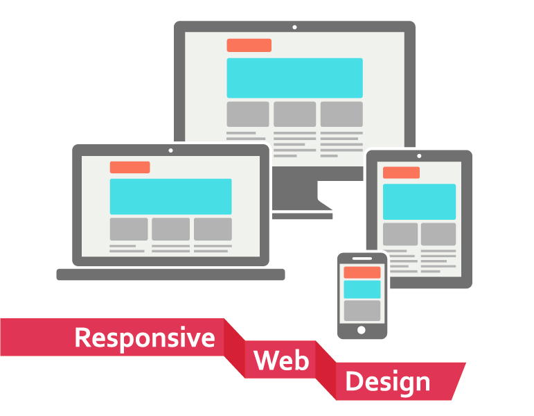
Responsive design for your Magento ecommerce solution, means the ability to view your website on the smaller screens of the mobile phones without losing the viewing experience for your website visitors. Well, just shrinking the site is not the answer. There are some very specific elements of the website that need to be changed in order to create a responsive experience for your visitors.
Well, websites that are not built for a responsive experience are very annoying and sometimes even frustrating to navigate. The navigation might be an endless scroll to find the right options, or a menu button may be cut off and untappable – there are many things to consider.
Here are a few tips to create a complete responsive experience for your website visitors:
Site Navigation for smaller devices
Creating an optimized site navigation is the most important part of a responsive design. All the important elements of the website should be easily locatable and easily accessible. The most common way of accomplishing this is to place all the navigable options under one menu. This menu should be accessible and easily locatable on the mobile screen.
The buttons should be atleast 44×44 pixels – this is the recommendation so that users can easily click on the menu with their thumbs and fingers.
Content Layout
Eye tracking studies show that visitors skim through web pages in an F shaped pattern. First from left to right, then down, then again a little lower, left to right – but not all the way. Well, that was for desktop websites. For mobile devices the pattern completely changes. Users follow an “I” pattern. Only one direction. For a Magento ecommerce website, this means that you need to place your call to action, such as “Buy Now” or “Place an Order” at the top of the screen preferably right. This is not a rule, but make sure that your call to action about buying your products is conspicuous enough.
Smartphone ecommerce
When visitors use smartphones to access your website, 67% of the users are more likely to buy from responsive websites. 52 % say that if the mobile experience is bad, they will not buy from the company in future too. It is expected that more than 80% of sales will be conducted via mobile devices by 2016. Smartphone ecommerce is booming and your business needs to align itself for the future.
Responsive experience
It’s about creating a responsive experience for your web visitors. Magento ecommerce development can take your business to the next level. Proper planning for navigation and content will definitely help your business work well on both desktop and mobile websites.
On a closing note, responsive websites are almost a mandate these days. Ensure that you understand all the elements that go behind making your Magento website a responsive one and ensure that you give your mobile customers a great shopping experience at your estore.
