Without a doubt, smart phones are becoming a primary access point to the web. It’s a world where Smartphone users will gradually but surely supersede the desktop and laptop users for browsing or even shopping online. When talking about online shopping, Magento is by far the most popular platform for creating online stores. With the very many high end smartphones available in the market, users find it more and more convenient to shop online from mobile devices.
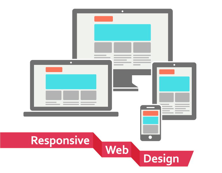
Current Statistics show that 30-50% of shopping is done via mobile devices which contribute to 50 – 70% of the revenue generated from a mobile site! A standard website when viewed on a mobile device however does not have a very appealing presentation for your users. Here’s where you need Magento Responsive design to create a great browsing experience for your mobile as well as desktop users. The website scales down to the screen size of the mobile device and displays all the important features for the mobile users. Magento Responsive Design is crafted using Cascading Style Sheets (CSS) media queries.
Here are the top reasons why you should make your Magento site responsive:
Great user experience for the mobile shopper
It’s frustrating for a customer to scroll an already small sized screen to navigate and find what they want. A Responsive design for your Magento website creates a positive impact on user experience and it’s also known that with a great user experience, a user is more than 67% likely to buy your products. Keeping a customer centric approach will ultimately help your business flourish.
30-50% shopping is done via mobile devices
2013 reports on Black Friday state that around 30-50% of the total online shopping is done via mobile devices. That’s quite a large amount of customers any business would afford to miss out on! Well, creating a responsive site with Magento web development could be your chance to tap this customer base and generate maximum revenue.
50-70% revenue for every mobile site
It’s true! 50-70% of the revenue is generated from mobile sites! So, needless to say, if you need to go with the flow of recent times, go responsive. Get your site reviewed by a Magento Development company to make it responsive and reach out to the mobile users. Sell more and profit more!
Good for SEO
Well, responsive design includes a single URL for mobile and desktop sites – it’s good for SEO. Your clicks from users are all counted in on one site and are not split under two URLs, well – easier to manage. Also, content from your site is not duplicated on multiple links which is good for Google.
Performance
Magento Responsive design helps you with all aspects of your website performance. Website loads as fast as possible for any user technology that is fully compatible with Smartphone devices. Responsive design more elegantly presents website product catalogs and improves site performance by creating a great overall customer experience while browsing your store via smartphones.
Good ROI
You might think that responsive websites will require an additional development cost. Initially, yes but long term it will save you a lot of time and money maintaining two versions of your website (one mobile and one not). Other than that, with increasing number of users that use mobile sites for shopping, means definite returns on investment for you.
Using responsive Magento ecommerce development will definitely make your website future ready, giving it the flexibility to handle the ever changing technology advances in the mobile world. Businesses will definitely see a dramatic change in the way their Magento store works in terms of rise in traffic and conversions. The mobile future is here – is your business ready?
